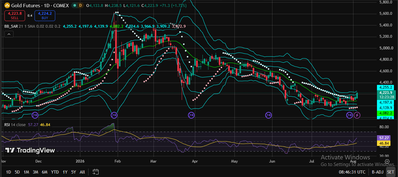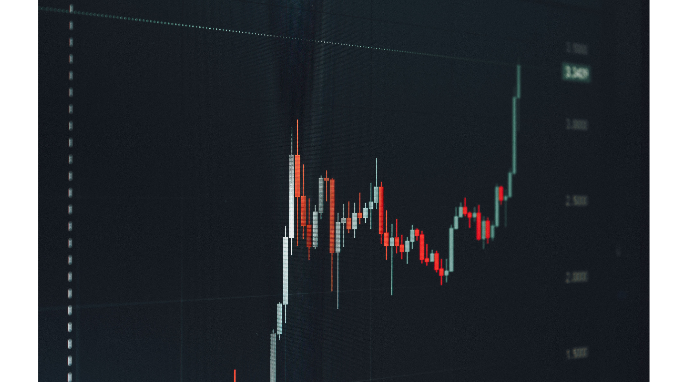
When I started intraday trading, my charting setup was a disaster.
Best Chart for Intraday Trading.Not because I didn’t have tools — I had too many. Three monitors, five indicators stacked on every chart, four different timeframes open simultaneously. I looked like someone who knew what they were doing.
I had absolutely no idea what I was doing.
Every morning I’d sit down, open my charts, and feel immediately overwhelmed. Price was moving. Indicators were crossing. Different timeframes were saying different things. By the time I’d processed everything and decided to enter a trade, the move was already over.
Or worse — I’d enter based on one indicator while three others were screaming the opposite. Then I’d spend the next 20 minutes arguing with myself about whether to hold or exit, while the trade slowly moved against me.
Six months of this. Six months of overcomplication, analysis paralysis, and inconsistent results.
The shift happened when I watched a trader I respected share his screen during a live session. His chart was almost empty. One timeframe. Clean price action. A couple of levels drawn. No indicator circus.
He took three trades that session. Two winners, one small loss. Clean, decisive, fast.
I asked him afterward what changed his trading. He said: “I stopped trying to see everything and started focusing on what actually matters for intraday.”
That conversation started my real education in chart setup for intraday trading — and what I learned over the following year completely transformed how I approach the markets every single day.
Why Chart Choice Matters More Than Most Traders Admit
Here’s something nobody really talks about directly: the chart type and timeframe you use for intraday trading affects not just what you see, but how you think and how you make decisions.
A cluttered chart creates a cluttered mind. When you have too much information competing for attention, your brain struggles to prioritize. You second-guess entries. You exit early. You hold losses longer than you should because three different signals are telling you three different things.
A clean, well-structured chart creates clarity. You see what matters. You make faster decisions. You stick to your plan because the plan is obvious on the chart, not buried under layers of indicators.
This is why two traders can look at the exact same market and reach completely different conclusions — and why the trader with the simpler setup often outperforms the one with the complex one.
The best chart for intraday trading isn’t the one with the most information. It’s the one that gives you the right information, at the right time, in a way that leads to clear, confident decisions.
The Candlestick Chart — Why It’s Still the Best for Intraday
If you’re using line charts or bar charts for intraday trading, switch to candlestick charts. Right now, before you do anything else.
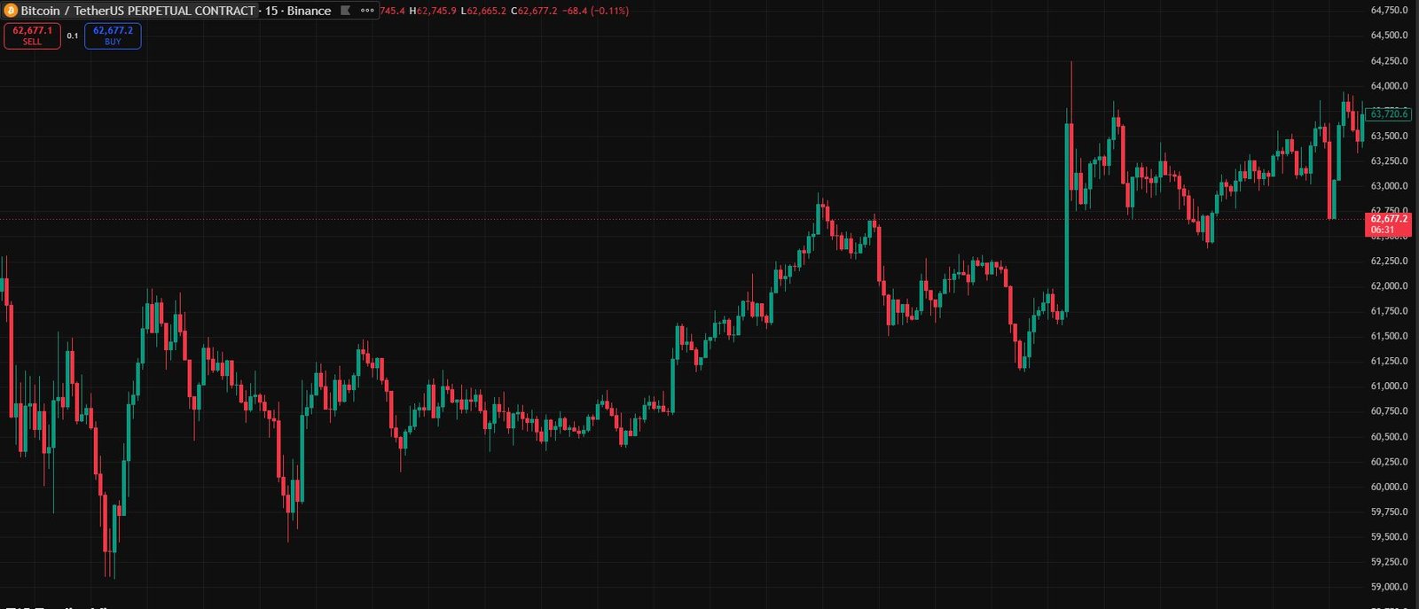
Candlestick charts give you four pieces of information in every single candle: the open, the high, the low, and the close. That’s the complete story of what happened in that time period — where price started, how far it went in both directions, and where it ended up.
A line chart only shows the close. You’re missing three quarters of the story.
Bar charts show the same information as candlesticks but in a format that’s much harder to read quickly. For intraday trading, where you need to process information fast and make decisions under pressure, ease of reading matters enormously.
Candlestick patterns also give you immediate visual information about momentum and sentiment. A large bullish candle with a small wick tells you buyers were in complete control. A candle with a long upper wick tells you sellers rejected higher prices aggressively. A tiny doji tells you the market is uncertain, at a decision point.
You can read all of this in a fraction of a second once you’re used to candlestick charts. That speed of comprehension is genuinely valuable in intraday trading.
I switched to candlestick charts about three months into my trading journey and never looked back. The clarity improvement was immediate.
The Timeframe Question — What Actually Works for Intraday
This is where I see the most confusion among newer intraday traders. Everyone wants to know: which timeframe should I use?
The honest answer is: it depends on your trading style. But let me give you the framework I actually use, because it’s more nuanced than just picking one number.
The Multi-Timeframe Approach — The One That Changed Everything For Me
I use three timeframes simultaneously for every intraday trade. Not more, not less. Three.
The Context Timeframe — Daily or 4-Hour
I start every trading session by looking at the daily chart. This gives me the big picture. Is the market trending up, down, or ranging? Where are the major support and resistance levels? What is the overall bias for the day?
This takes about five minutes. But those five minutes save me from taking trades against the dominant trend — which is one of the most expensive mistakes in intraday trading.
If the daily chart shows a strong downtrend, I’m looking for short setups on the lower timeframes, not longs. Simple rule. Saves a lot of money.
The Setup Timeframe — 1-Hour or 15-Minute
This is where I look for the actual pattern or setup. An inverse head and shoulders. A bull flag. A break and retest of a key level. Whatever setup I trade, I identify it on this timeframe.
The 1-hour is my preferred setup timeframe for swing-within-day trades. The 15-minute works better for faster, more active intraday styles.
The Entry Timeframe — 5-Minute or 1-Minute
Once I’ve identified a setup on the 15-minute or 1-hour, I drop down to the 5-minute to fine-tune my entry. This lets me get a tighter entry with a smaller stop loss — which directly improves my risk-to-reward ratio.
For example: I see a bullish setup on the 15-minute chart at a key support level. Instead of entering immediately, I drop to the 5-minute and wait for a bullish confirmation candle right at the support. That one step tightens my entry by several pips and reduces my risk.
This three-timeframe approach — context, setup, entry — is the framework that finally made intraday trading consistent for me. Not because it’s complicated, but because it forces a structured thought process before every trade.
The 5-Minute Chart — The Intraday Workhorse
If I had to pick one single timeframe for intraday trading — and sometimes people genuinely need to keep it that simple — I’d choose the 5-minute chart.
Here’s why it works so well:
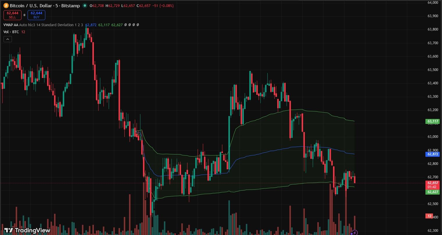
The 5-minute chart is fast enough to catch meaningful intraday moves while being slow enough to filter out the noise of the 1-minute chart. Each candle represents five minutes of real trading activity — enough time for institutional moves to show up clearly, but not so short that every random spike becomes a signal.
For a typical intraday session of 6-8 hours, a 5-minute chart gives you 72-96 candles to work with. That’s enough data to see patterns, identify key levels, and make informed decisions without the screen looking like a wall of noise.
I use the 5-minute chart for:
- Identifying intraday support and resistance levels
- Spotting breakout setups and flag patterns
- Timing entries after higher timeframe confirmation
- Setting precise stop losses based on recent candle structure
One specific habit on the 5-minute chart that improved my win rate: I wait for the candle to close before acting on a signal. Not the wicks. The close. A 5-minute candle that pokes above a resistance level but closes below it is not a breakout. Waiting for the close eliminates a huge number of false signals.
The 15-Minute Chart — Better for Less Hectic Trading
If the 5-minute feels too fast — if you’re missing entries or constantly getting stopped out on noise — the 15-minute chart might suit you better.
The 15-minute chart filters out more short-term noise. Patterns are cleaner. Levels are more reliable. The trades it generates are slightly fewer but often higher quality.
I know traders who exclusively use the 15-minute chart for intraday and do extremely well. It allows for a less frantic trading pace — you have more time to evaluate setups and make decisions without the constant pressure of fast-moving 5-minute candles.
The 15-minute is particularly good for:
- Trading the London-New York overlap session in forex
- Identifying morning patterns in stock indices
- Traders who work full-time and can’t watch the screen every minute
If you’re newer to intraday trading, I’d actually suggest starting with the 15-minute rather than the 5-minute. Build your pattern recognition and decision-making process at a pace that allows you to think clearly. You can always move to faster timeframes later.
TradingView — The Best Charting Platform for Intraday
I’ve used several charting platforms over the years. MetaTrader 4, MetaTrader 5, ThinkorSwim, ProRealTime, and others. For intraday trading, TradingView is the best — and it’s not particularly close.
Here’s what makes TradingView work so well for intraday specifically:
Clean, fast charts.
The rendering is smooth even on fast timeframes. Candles update in real time without lag. On a busy 1-minute or 5-minute chart during a volatile session, this matters more than you’d think.
The drawing tools are excellent.
Horizontal lines, trend lines, rectangles for marking zones — all are fast to draw and easy to manage. I can mark a key level in about three seconds. On MetaTrader, the same task takes longer and the lines are harder to manage.
Multi-timeframe view.
TradingView lets you open multiple chart windows simultaneously or use the layout feature to view different timeframes of the same instrument side by side. This is exactly what you need for the three-timeframe approach I described earlier.
Price alerts.
You can set alerts at any price level and get notified by browser notification, email, or app push notification. I set alerts at key intraday levels every morning. When price approaches, I get notified — I don’t have to stare at the screen all day waiting.
The free version is genuinely usable.
You get three indicators per chart, access to all timeframes, and most of the drawing tools. For a beginning intraday trader, the free version is completely adequate.
The paid version (Pro or Pro+) adds more indicators per chart, more saved layouts, and faster data. Once you’re consistently profitable, the upgrade is worth it. But don’t pay before you need to.
For mobile, the TradingView app is excellent. Clean interface, all the same tools, real-time data. I check charts on my phone constantly between desk sessions.
The Indicators I Actually Use — And Why I Use So Few
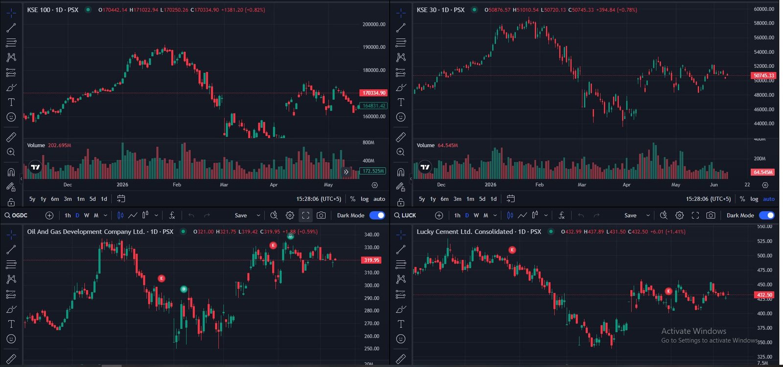
After years of trying everything — RSI, MACD, Bollinger Bands, Stochastic, multiple moving averages, volume profile, VWAP, and about fifteen others — here’s what I use for intraday trading now:
1. Volume
That’s it for the first one. Volume is the one indicator I’d never remove from an intraday chart. It tells you whether the moves you’re seeing are supported by real conviction or just noise.
A breakout with volume is real. A breakout without volume is suspicious. A reversal on high volume means something. A reversal on thin volume might just be a temporary move.
Volume is always on my intraday charts. Always.
2. VWAP — Volume Weighted Average Price
VWAP is the average price weighted by volume throughout the trading day. It’s the reference point that institutional traders use to evaluate whether they’re getting a good price on their orders.
On intraday charts, price tends to gravitate toward VWAP. Breakouts above VWAP with volume often continue. Price trading below VWAP in a session that started strong is a warning sign.
I use VWAP as a dynamic reference level — not as a mechanical buy/sell signal, but as context. Is price above or below VWAP? That tells me something about intraday sentiment.
3.Horizontal Levels — Not an Indicator, But Essential
Before every session I spend ten minutes drawing the key horizontal levels on my charts. Previous day high and low. Overnight session high and low. Any obvious support or resistance from the last few days.
These levels are where the most reliable intraday setups happen. Breakouts of previous day highs. Bounces from previous day lows. These are the moves that happen consistently, day after day, because institutional traders are watching the same levels.
That’s the complete setup. Volume, VWAP, and manually drawn horizontal levels. Three things. It sounds almost too simple. But simplicity in charting creates clarity in thinking — and clarity in thinking creates better decisions.
What I Stopped Using and Why
RSI for intraday entries.
RSI is useful for identifying divergence on higher timeframes. For intraday trading, “overbought” and “oversold” readings are almost meaningless. In a strong trending day, RSI can sit above 70 for hours while price keeps climbing. I’ve exited good trades early because RSI said “overbought” — that’s money I left on the table.
Multiple moving averages.
I had three moving averages on my chart for over a year. 20 EMA, 50 EMA, 200 EMA. The chart looked busy. The signals conflicted. I spent more time watching the EMAs than watching price. Removed them all. Trading became clearer immediately.
MACD for intraday.
MACD is a lagging indicator. For swing trading on daily charts, the lag is less problematic. For intraday trading where moves can be 20-30 minutes long, MACD often signals after the best entry has already passed. I stopped using it for intraday entirely.
Chart Setup Mistakes That Cost Me Money
Changing timeframes mid-trade.
I’d enter a trade on the 15-minute chart, get nervous when it moved against me slightly, then switch to the 1-minute chart to “check.” The 1-minute always looked more alarming. I’d exit. Then watch the 15-minute play out exactly as expected without me. Pick your timeframe before the trade. Stay on it.
Drawing too many levels.
At one point I had 15-20 horizontal lines on my chart. Every level I drew became a reason to exit early or not enter at all. Now I have a maximum of 5-6 key levels marked at any time. If a new level is more important, I remove an older one.
Watching the wrong market.
I once had S&P 500, Nasdaq, Bitcoin, EUR/USD, and GBP/USD all open simultaneously during an intraday session. I was watching everything and trading nothing well. Intraday trading requires focus. Pick one or two instruments you know well and trade those exclusively. Depth over breadth.
Not adjusting for volatility.
The chart setup that works during a calm Tuesday afternoon doesn’t work the same way during a Fed announcement or CPI release day. High volatility sessions need wider stops and more room on the chart. I’ve been stopped out of perfectly good trades because I used my normal tight intraday stops during abnormally volatile sessions.
Using tick charts before understanding time-based charts.
Tick charts — which create a new candle after a set number of transactions rather than after a set time — are used by some advanced intraday traders. I tried them early on, got confused, and went back to time-based charts. Learn to read 5-minute and 15-minute time-based charts first. Tick charts are an advanced tool, not a shortcut.
The Morning Routine That Sets Up My Chart for the Day
Before any intraday session, I do the same thing every morning. Takes about 15-20 minutes.
1: Check the daily chart first. What happened yesterday? What is the overall trend? Are we near any major support or resistance? This gives me the context for the entire day.
2: Mark the previous day’s high and low. These are the most important intraday levels. A break above the previous day’s high is a significant move. A break below the previous day’s low is equally significant.
3: Check the overnight session. I trade forex and indices. The overnight session often sets up levels that are respected during the day session. Mark the overnight high and low.
4: Identify any obvious pattern forming. Is there a flag, a range, a pending breakout on the 1-hour chart? Knowing the potential setups before the session starts means I’m not hunting for trades in real time — I’m waiting for specific things to happen.
5: Check the economic calendar. Forex Factory takes 60 seconds. I mark the high-impact news times on my chart using TradingView’s event markers. I either avoid trading 15 minutes before and after major events, or I factor the volatility into my stops.
6: Set price alerts. At every key level I’ve marked, I set a TradingView alert. I don’t need to watch the screen constantly. The alert tells me when something important is happening.
The whole routine takes 15-20 minutes. But it means I walk into every session with a clear plan, clear levels, and clear conditions for entry — instead of improvising in real time.
Heikin Ashi Charts — Worth Knowing About
One chart type I haven’t mentioned yet but use occasionally for context: Heikin Ashi.
Heikin Ashi candles are a modified version of regular candlesticks that smooth out price action by averaging the open, close, high, and low in a specific way. The result is a chart that looks smoother and makes trends easier to see visually.
The advantage: it’s much easier to see when a trend is strong and when it’s weakening. Strong uptrends show consecutive green candles with no lower wicks. The moment lower wicks appear or candles become smaller, it signals weakening momentum.
The disadvantage: because the values are modified, you can’t use Heikin Ashi for precise entry timing or exact stop placement. The prices on the candles don’t represent actual traded prices.
I use Heikin Ashi occasionally on the 1-hour chart to get a quick read on trend strength. Then I switch back to regular candlesticks for actual entry timing.
For beginners, I’d stick with regular candlestick charts until you’re very comfortable. Heikin Ashi is a useful supplementary tool, not a replacement.
The Chart Setup That Works — Summary
If you want the simple version of everything I’ve explained, here it is:
Platform: TradingView — free version to start
Chart type: Candlestick — always
Primary timeframe: 15-minute for setups, 5-minute for entries
Context timeframe: 1-hour or daily — check before every session
Indicators: Volume + VWAP + manually drawn horizontal levels
Pre-session routine: 15-20 minutes of chart preparation every morning
That’s it. Everything else is noise until you’ve mastered these fundamentals.
The traders who struggle with intraday trading are usually adding complexity to compensate for uncertainty. More indicators feel like more information. More information feels like more safety.
But in intraday trading, clarity beats complexity every time. The market moves fast. Your decision-making process needs to be faster. The simpler your chart, the faster and more confidently you can act.
What the Best Intraday Traders Have in Common
I’ve watched and spoken to many consistently profitable intraday traders over the years. Their setups are different. Their strategies are different. Their personalities are different.
But almost every single one of them has a simple chart.
Not because they don’t know about advanced indicators or complex chart types. Because they tried them, found they didn’t help, and stripped back to what actually worked.
That stripping-back process is something almost every serious trader goes through. Some do it quickly. Others spend years adding complexity before finally simplifying.
If you’re in the early stages of building your intraday setup, consider skipping the years of complexity and going straight to simple. Clean chart, key levels, volume, good timeframe selection, consistent pre-session routine.
The market will still be challenging. Intraday trading is genuinely difficult and most people who try it don’t succeed. But giving yourself a clear, uncluttered view of what’s happening is the foundation everything else has to be built on.
Start simple. Stay consistent. Adjust only what genuinely needs adjusting based on real results, not theory.
Frequently Asked Questions
Which chart pattern is best for intraday trading?
Bull flag, bear flag, and break-and-retest are the most reliable intraday patterns. They form quickly, give clear entry points, and work consistently across forex, stocks, and crypto.
Why do 97% of day traders lose money?
Because they trade without a proper plan, ignore risk management, and let emotions drive decisions. Overtrading, revenge trading, and using too much leverage finish off the rest.
How to earn 1000 RS per day in intraday trading?
Focus on consistency and risk management first — not daily targets. Build a profitable strategy first, then position sizing will naturally generate consistent returns over time.
What is the 3 5 7 rule in day trading?
Never risk more than 3% per trade, keep total open exposure under 5%, and ensure your winners are at least 7% bigger than your losers. It keeps losses small and profits growing.
Disclaimer: This article is for educational purposes only and does not constitute financial or investment advice. Intraday trading involves significant risk of loss. Always conduct your own research and consider consulting a qualified financial advisor before making any trading decisions.

Hira Ch is a Forex trader and financial content writer specializing in gold, crypto, and currency markets.Based in Lahore, she breaks down complex trading
concepts into simple, actionable insights at ExpertJourny.