Inverse Head And Shoulder Pattern.I almost closed the trade for a $340 loss.
GBP/USD had been falling for three weeks straight. Every bounce got sold. Every “recovery” lasted two days before sellers came back in. I had a long position open from a level I thought was support, and it had done nothing but bleed since I entered.
My finger was hovering over the close button. I was done with the trade mentally.
Then my trading buddy — someone I’d met in a Telegram group — sent me a message: “Bro, are you watching GBP/USD right now? That looks like an inverse H&S forming on the 4H.”
I had heard of the head and shoulders pattern. The inverse version? I kind of knew it existed but I’d never actually traded it intentionally. I zoomed out on TradingView, drew the pattern he was describing, and suddenly what had looked like random price chaos started making a very specific shape.
I held the trade.
Over the next six days, GBP/USD climbed 280 pips. My $340 paper loss turned into a $190 profit.
That one trade made me obsessed with the inverse head and shoulders. I spent the next two months studying it, drawing it on historical charts, backtesting it, and then trading it live. This article is everything I learned — the real version, including the mistakes and the times it didn’t work.
What the Inverse Head and Shoulders Actually Looks Like
Let me describe it the way I wish someone had described it to me — without the textbook language.
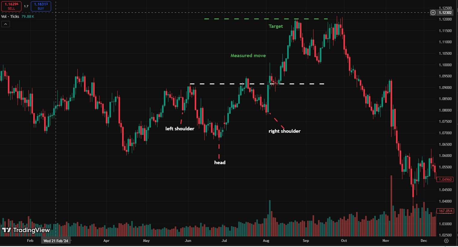
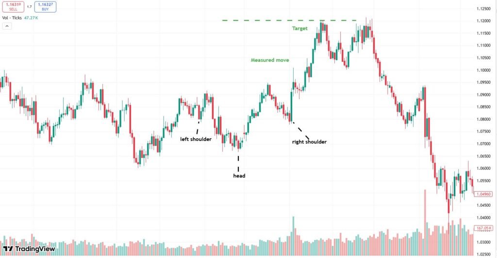
Imagine price has been falling. It drops to a low, bounces a bit, drops again even lower, bounces again, drops one more time but this time not as low as the middle drop, and then bounces again.
Those three lows form the pattern:
- First low — left shoulder
- Second low (deepest) — head
- Third low (similar height to the first) — right shoulder
The bounces between them form a roughly horizontal line called the neckline. It’s the ceiling that price keeps hitting and failing to break through — until it finally does.
When price breaks and closes above the neckline after forming those three lows, that’s your signal. That’s the inverse head and shoulders completing, and it suggests the downtrend may be over and a new uptrend is beginning.
That’s it. That’s the whole pattern visually. The hard part isn’t understanding the shape — it’s recognizing it in real time, when price is messy and imperfect, which it always is.
Why This Pattern Actually Makes Sense (Not Just Chart Theory)
I used to treat chart patterns like horoscopes — shapes that might mean something but probably didn’t. Then I started thinking about what was actually happening behind the pattern in terms of buyer and seller behavior, and it started making real sense.
Here’s what the three lows represent:
Left shoulder:
Sellers push price down hard. Buyers step in and create a bounce. But sellers come back and push lower — making the head.
Head:
This is the climax of selling pressure. Price reaches its lowest point. But something interesting happens — buyers absorb all that selling and push price back up. For the first time, the bounce is stronger than the previous ones.
Right shoulder:
Sellers try one more time. But they can’t get price back down to where the head was. They’re running out of momentum. The bounce from the right shoulder has more conviction.
Neckline break:
When price finally pushes above the neckline, the remaining sellers give up. Their stop-losses get triggered. New buyers pile in. The combined effect launches price higher — sometimes aggressively.
Understanding this helped me stop seeing the pattern as a magic shape and start seeing it as a story about who’s winning between buyers and sellers. When I look at it that way, the neckline break feels logical rather than arbitrary.
The GBP/USD Trade in Detail
Let me walk through that trade properly because it illustrates every key concept.
What I saw on the 4-hour chart:
Left shoulder formed around 1.2580 — price bounced back to 1.2680 (the neckline area).
Head formed at 1.2510 — the lowest point. Bounced strongly back to 1.2690, slightly above the previous bounce.
Right shoulder forming at 1.2560 — higher than the head, lower than the left shoulder. This asymmetry is normal and actually healthy.
The neckline was sitting around 1.2685-1.2700.
My entry:
I was already in the trade from 1.2600 — caught in the downtrend. When I recognized the pattern, instead of closing, I added a small second position when price broke and closed above 1.2700.
Stop-loss:
Below the right shoulder at 1.2540. If the right shoulder broke down, the pattern was invalid.
Target:
I used the classic measurement — the distance from the head (1.2510) to the neckline (1.2695) is about 185 pips. Adding that to the neckline break gives a target around 1.2880.
Price reached 1.2870 before pulling back. Close enough.
What I learned from this trade specifically:
The pattern gave me a logical reason to hold a trade I was about to panic-close. That psychological function of the pattern is underrated. It’s not just about entries — it helps you manage existing positions more calmly when you can see the structure.
How to Draw and Identify the Pattern — Step by Step
This is where most tutorials get vague. Here’s exactly what I do on TradingView when I’m looking for this pattern.
Step 1: Look for a clear downtrend first
The inverse head and shoulders only matters after a meaningful downtrend. If price has just been going sideways or slightly down, the pattern means much less. I want to see price down at least 3-5% from a recent high before I start looking for the reversal pattern.
Find the three lows
Using the bar tool in TradingView, I mark the three significant lows. The middle one (head) should be the lowest. The two shoulders should be roughly similar in depth — they don’t have to be identical, but if one shoulder is dramatically lower than the other, the pattern is less reliable.
Draw the neckline
Connect the two bounce highs between the shoulders and the head. Sometimes this line is perfectly horizontal. More often it slopes slightly — either up or down. A slightly upward-sloping neckline is actually a bullish sign. A downward-sloping neckline makes the pattern less reliable in my experience.
Wait for the right shoulder to form completely
This is where patience matters. The pattern isn’t complete until the right shoulder has formed AND price has started moving back toward the neckline. Don’t enter during the right shoulder formation — you don’t know yet if it’s the right shoulder or if price is going to crash to new lows.
Watch for the neckline break
I set a TradingView price alert at the neckline level. When it triggers, I go to the chart and look for a candle that closes above the neckline — not just wicks above it. A closing candle gives me much more confidence than an intraday spike.
Confirm with volume (if available)
On stocks and indices, volume should increase on the neckline break. On Forex, volume data is less reliable (we only see tick volume, not actual transaction volume). For Forex, I focus more on candle structure — a strong, full-bodied candle closing above the neckline is my confirmation.
Measuring the Target — The Method That Works for Me
Every article about chart patterns mentions the “measured move” target. Here’s how I actually use it.
Measure the distance in pips from the lowest point of the head to the neckline. Add that distance to the neckline breakout point.
Example from the GBP/USD trade:
- Head low: 1.2510
- Neckline: 1.2695
- Distance: 185 pips
- Neckline break: 1.2700
- Target: 1.2700 + 185 = 1.2885
I treat this as a guide, not a guarantee. I usually take partial profits at 60-70% of the measured target and let the rest run with a trailing stop. This approach has protected my profits more times than it has cost me upside.
The Timeframe Question — Which One Should You Use?
I get asked this a lot. My honest answer: the pattern works on all timeframes but the quality differs significantly.
Daily chart: Most reliable. The patterns that form over weeks on the daily chart tend to be more meaningful and the moves that follow are larger. I always check the daily chart first to see if there’s a larger inverse H&S in play before zooming in.
4-hour chart: My main trading timeframe for this pattern. Good balance between signal quality and trading frequency. This is where I found the GBP/USD pattern.
1-hour chart: Valid but noisier. More false breakouts. I use the 1-hour to time entries after I’ve identified the pattern on the 4-hour or daily.
15-minute and below: Too much noise. The pattern forms and fails too quickly. I don’t trade this pattern on anything below the 1-hour chart.
One rule I follow: the pattern on a higher timeframe always overrides the pattern on a lower timeframe. If the daily chart is showing a downtrend with no reversal signals, I won’t trade an inverse H&S on the 4-hour chart against that trend.
Three More Trades — What Worked and What Didn’t
2 — EURUSD, 4-hour — Worked
Clear three-lows structure after a 3-week downtrend. Neckline at 1.0820. Break happened on a strong NFP (Non-Farm Payrolls) day — dollar weakened sharply, price shot through the neckline. I had an alert set and entered on the retest of 1.0820 from above. 140 pip move. Clean trade.
Lesson: News events can accelerate neckline breaks. If a high-impact news event aligns with your pattern, the move can be faster and stronger than usual.
3 — Gold (XAUUSD), daily chart — Worked but I exited early
Pattern took three weeks to form on the daily chart. Head was at $1,810. Neckline around $1,865. I entered on the break, set my target at $1,920. Gold hit $1,915 and I closed. It continued to $1,960.
Lesson: I was too quick to close because the trade had taken three weeks already and I was emotionally tired of holding it. Patience on daily chart trades is a different skill from patience on 4-hour trades. I’m still working on this.
4 — USDJPY, 4-hour — Failed
Pattern looked perfect. Three clear lows, symmetrical shoulders, clean neckline at 133.50. I entered on the break. Price moved up about 60 pips, then reversed and broke back below the neckline. Stopped out for a 55 pip loss.
What went wrong: I checked later and the Bank of Japan had made a surprise announcement that morning which strengthened the yen. My pattern analysis was technically correct but the fundamental backdrop destroyed the setup. Now I check the economic calendar before entering any inverse H&S trade.
Mistakes I See Traders Make With This Pattern
Forcing the pattern where it doesn’t exist
This is the most common one. You want to see an inverse H&S so badly that you start seeing it in random price action. The shoulders don’t have to be perfect — but they have to be genuinely present. If you’re mentally stretching to make the shape fit, it’s probably not there.
I keep a simple rule: if I can’t explain the pattern clearly to someone in 30 seconds, it’s not clean enough to trade.
Entering before the neckline breaks
Anticipating the neckline break is tempting. “I’ll get a better entry if I buy during the right shoulder formation.” Sometimes it works. More often, price continues lower and there was no right shoulder — it was just another leg down. Wait for the break. The few pips you give up by waiting are worth the confirmation.
Ignoring the larger trend
If the weekly chart is in a strong downtrend and you’re trying to trade an inverse H&S on the 4-hour chart, you’re fighting a much bigger force. The pattern can work against the larger trend — but the failure rate is significantly higher. I prefer patterns that align with at least the daily trend direction.
Setting stop-loss too tight
The right shoulder can extend lower than expected before price finally turns. A stop-loss placed right at the bottom of the right shoulder gets hit frequently before the actual reversal. I place my stop 10-15 pips below the right shoulder low to give the trade room.
Not having a target before entering
If you don’t know your target when you enter, you’ll exit based on emotion — either too early when you’re nervous or too late when you’re greedy. Calculate the measured target before the trade and decide in advance what percentage of it you’ll take.
How I Set Up Alerts on TradingView
Since I don’t stare at charts all day, I use TradingView alerts to manage this pattern efficiently.
When I identify a potential inverse H&S forming:
Alert 1: Set at the neckline level — “Price crosses above [neckline].” This fires when the break happens.
Alert 2: Set at the right shoulder low — “Price crosses below [right shoulder low].” This fires if the pattern is invalidating.
When Alert 1 fires, I check the chart, confirm the candle is closing above the neckline (not just spiking), and then decide on entry.
This system means I can follow 8-10 setups simultaneously without sitting at the computer all day. The alerts do the watching; I do the deciding.
The Retest Entry — My Preferred Way to Enter
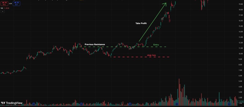
After price breaks above the neckline, it often comes back to test the neckline from above. This retest is my favorite entry point.
Here’s why it’s better than entering immediately on the break:
The breakout candle can have a wide spread — you might enter at a poor price during the initial spike. The retest gives you a calmer entry, usually with a tighter spread, and a natural stop-loss level (just below the retested neckline).
The GBP/USD trade I mentioned — my second position entry was actually on the retest of 1.2700 from above, about 8 hours after the initial break. Much cleaner entry.
Not every neckline gets retested. Sometimes price just takes off after the break and never looks back. This is why I split my entry: I take a partial position on the break and add more on the retest if it happens.
Quick Checklist Before I Enter an Inverse H&S Trade
Before clicking buy, I run through this:
1. Clear downtrend before the pattern — yes or no? 2. Three distinct lows with the middle one deepest — yes or no? 3. Neckline is roughly horizontal or slightly upward sloping — yes or no? 4. Price has closed above the neckline (not just wicked) — yes or no? 5. No major news event in the next 2 hours — check Investing.com 6. Stop-loss placed below right shoulder — calculated? 7. Target measured and noted — done? 8. Position size based on risk percentage, not fixed lots — calculated?
If any of these is “no” or “not yet” — I wait. The trade will either set up properly or it won’t. There’s always another one.
One Thing Nobody Tells You About This Pattern
It takes longer to form than you expect. Always.
When I first started trading it, I would identify what I thought was a nearly-complete pattern and expect the neckline break within hours. Then price would grind sideways for days, forming a messier right shoulder than I anticipated, before finally breaking.
This waiting period is where most traders give up or start second-guessing. They either exit early or start adding to the position impatiently.
My current approach: once I’ve identified the pattern and set my alerts, I close TradingView and go do something else. I trust the alert to tell me when the important moment arrives. The less I watch it form, the better my trading decisions are when the setup finally completes.
Chart patterns are like watched pots. The moment you stare at them too intensely, you start seeing things that aren’t there and making decisions you don’t need to make.
Tools and Platforms That Help
TradingView — Everything I’ve described is done here. Drawing the pattern is fast with the horizontal line tool (Alt+H) and the freehand drawing tool for sloped necklines. Alerts are set in seconds. The multi-timeframe layout (4-hour + daily side by side) lets me check context without switching tabs constantly.
MetaTrader 5 — Where I execute trades. I’ve gotten used to setting pending orders (Buy Stop above the neckline) so I don’t have to be watching when the break happens. MT5 fills the order automatically if price hits my entry level.
Investing.com — Economic calendar before every trade. Non-Farm Payrolls, CPI, central bank decisions — any of these can destroy or turbocharge a pattern setup. Knowing the calendar is part of the trade.
My trading journal (Google Sheets) — Every inverse H&S trade I’ve taken is logged. Success rate, average R:R, which timeframes performed better, which pairs. After 30+ trades in this pattern, my journal shows a 58% win rate with an average of 2.1R on winners. That’s enough to be profitable even with losses — but I only know that because I tracked it.
A Final Thought
The inverse head and shoulders is one of the most studied patterns in technical analysis — and that’s actually a reason to be careful with it.
Because everyone knows it, the false breakouts are common. Big players know where retail traders place their entries (just above the neckline) and their stops (below the right shoulder). Sometimes the neckline gets broken cleanly, moves up 30 pips, and then reverses to stop everyone out before continuing higher.
This is why I wait for candle closes rather than intraday breaks. This is why I give my stop-loss extra room. And this is why I never bet everything on a single pattern setup — even when it looks perfect.
The pattern doesn’t guarantee anything. What it does is give you a framework to make a logical, structured decision in a market that can feel chaotic. That structure — having a clear entry trigger, a clear stop-loss level, and a clear target — is worth more than the pattern itself.
Trade it with discipline and it’ll be one of the most useful tools in your chart reading. Trade it with excitement and impatience and it’ll cost you a lot of tuition fees.
I’ve paid both kinds. The disciplined version is better.
Frequently Asked Questions:
Q1: Is an inverse head and shoulders bullish?
Yes — the inverse head and shoulders is a strongly bullish pattern. It signals that sellers are losing control and buyers are stepping in, typically leading to a significant upward price move after the neckline breaks.
Q2: What is the inverse head and shoulders pattern?
It’s a reversal chart pattern that forms after a downtrend — with three lows where the middle low (head) is the deepest and the two outer lows (shoulders) are higher, signaling a trend reversal from bearish to bullish.
Q3: What is the most successful trading pattern?
The head and shoulders and inverse head and shoulders are widely considered the most reliable chart patterns — studies show they have a completion rate of over 80% when the neckline breaks with strong volume.
Q4: What is an inverse head and shoulders?
An inverse head and shoulders is a bullish reversal pattern showing three bottoms — a lower middle bottom flanked by two higher bottoms — that appears at the end of a downtrend and signals price is ready to move significantly higher.
Disclaimer: This article is based on personal trading experience and is for educational purposes only. It does not constitute financial advice. Trading forex and other financial instruments involves significant risk of loss. Always conduct your own research and consider speaking with a qualified financial advisor before making trading decisions.

Hira Ch is a Forex trader and financial content writer specializing in gold, crypto, and currency markets.Based in Lahore, she breaks down complex trading
concepts into simple, actionable insights at ExpertJourny.